Here is my blog documenting my projects for Intro to Layout!
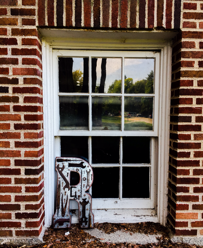
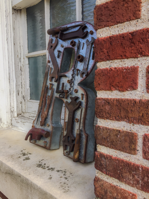
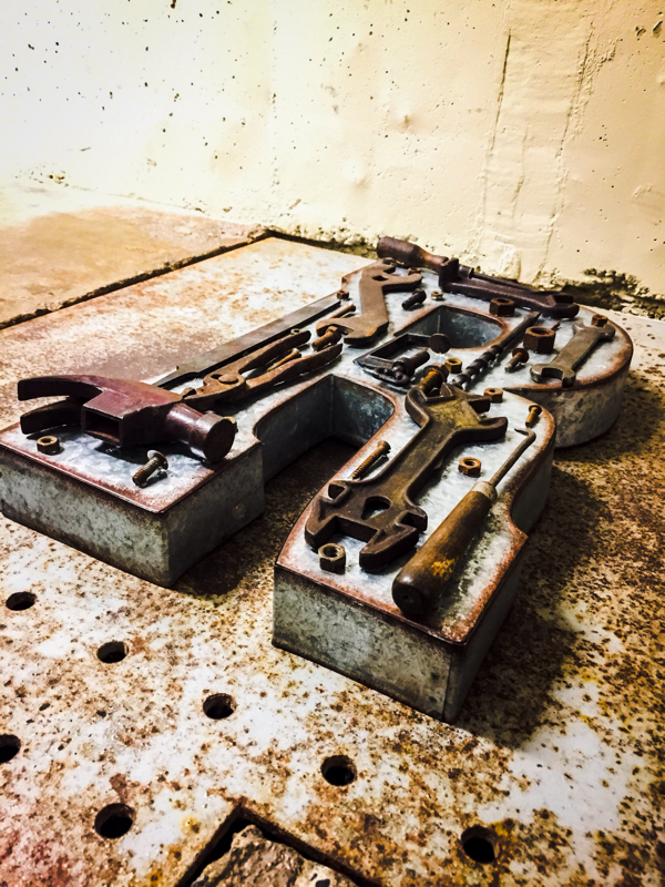
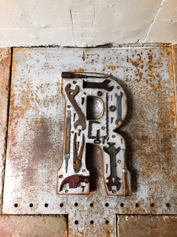
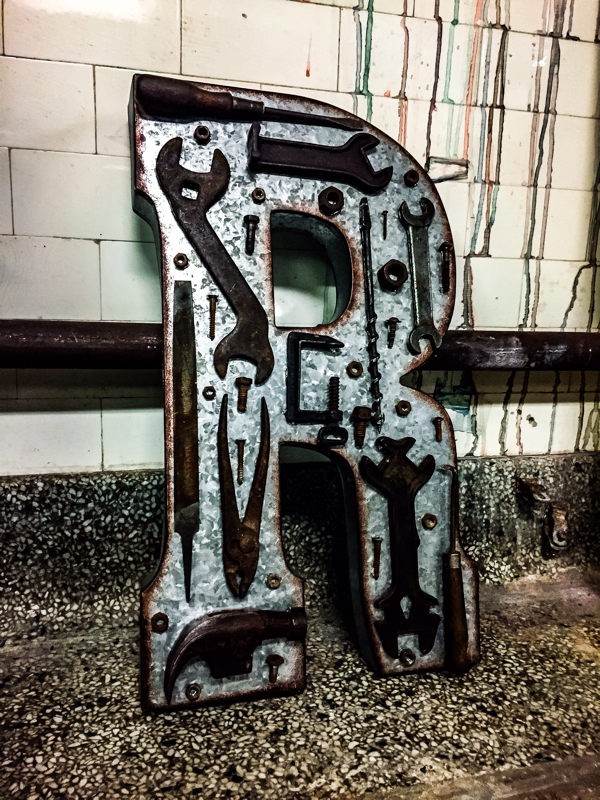
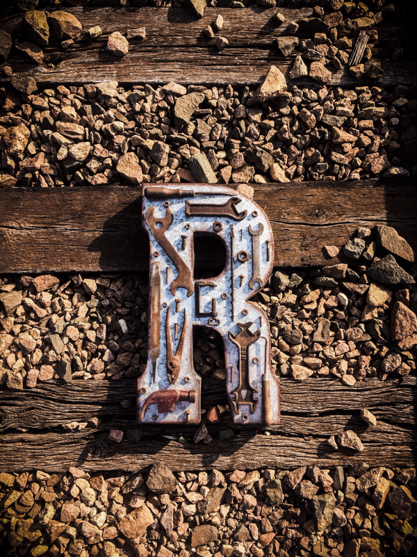
Project #1: Sculptural Lettering
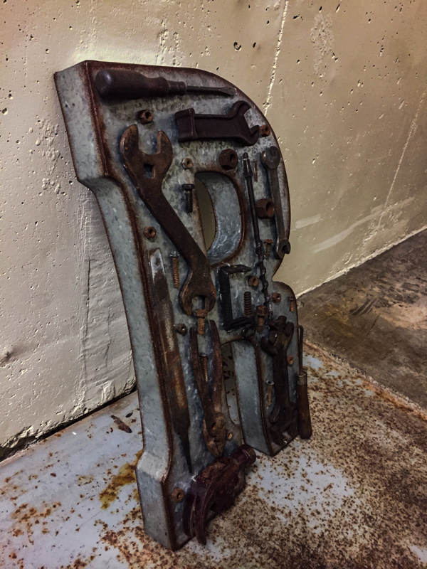
- Letter: R
- Font: Copperplate Gothic
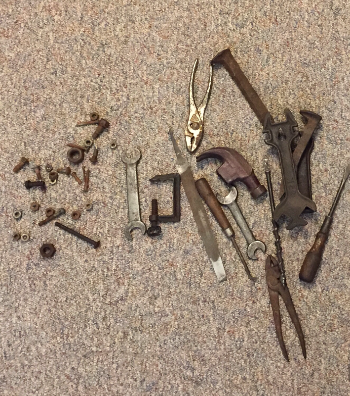
- Materials: wire, chicken wire, spray paint, rusty tools, glue
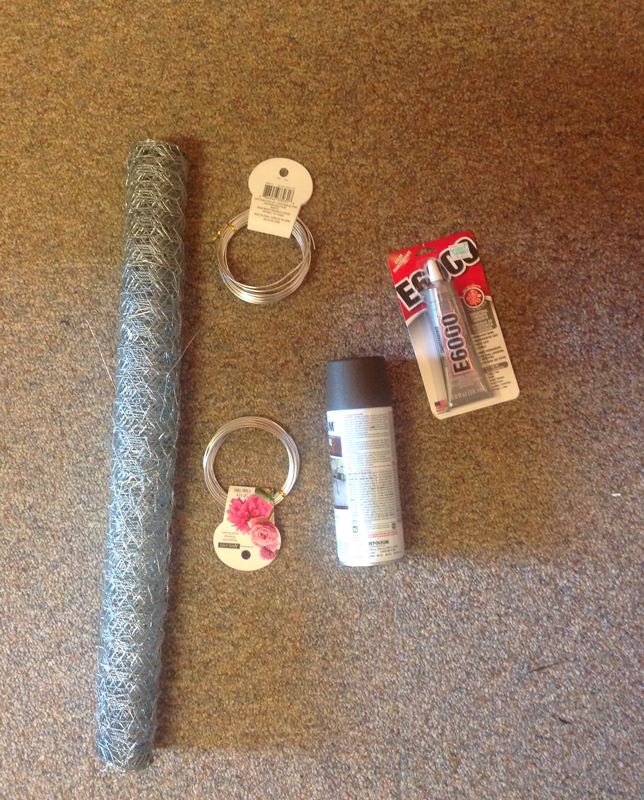
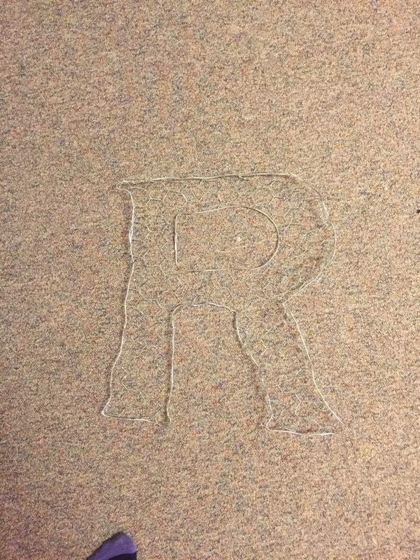
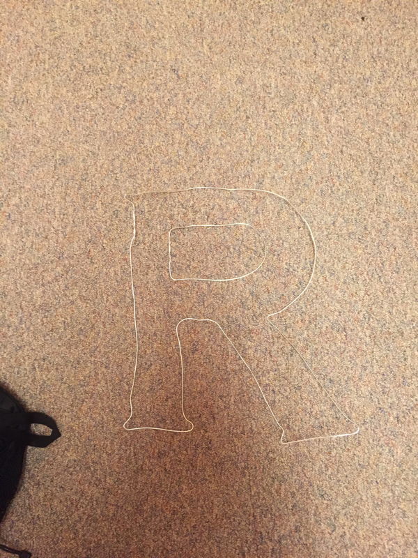
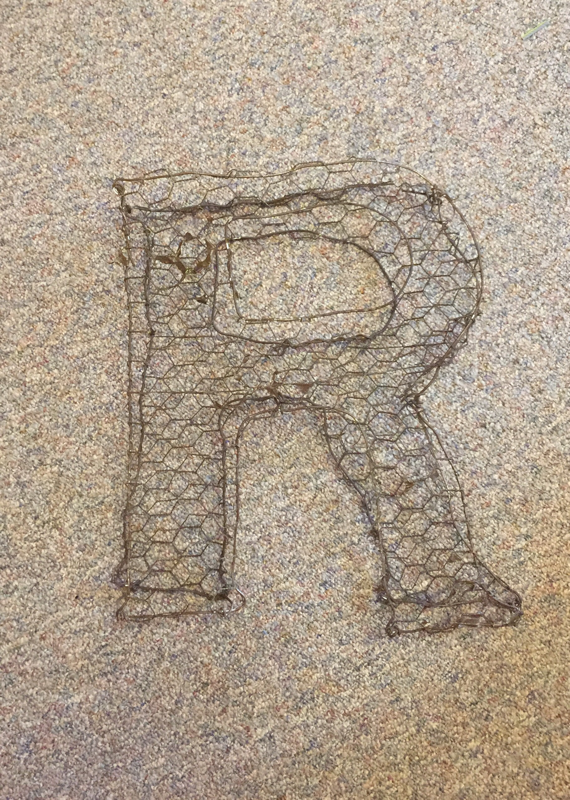
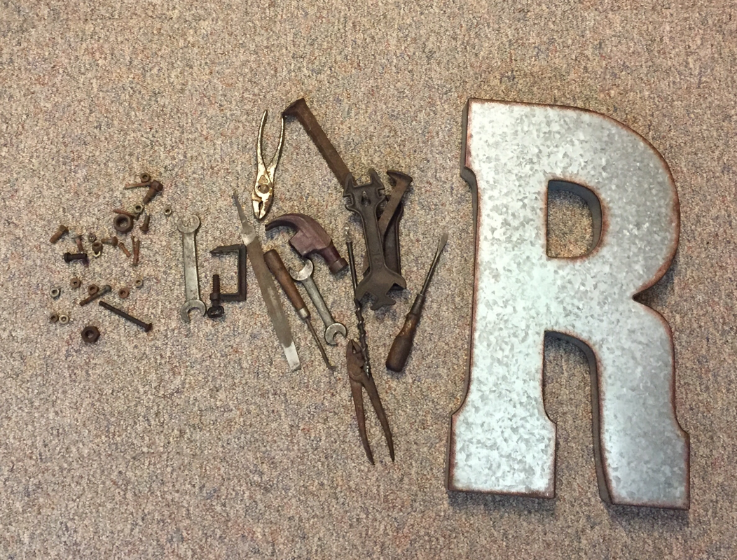
After putting together my wire, painting it and starting to lay tools on it, I decided to move to my back-up plan. The wire just isn't strong enough to hold the tools. I expected this to happen so I'm glad I had another option!
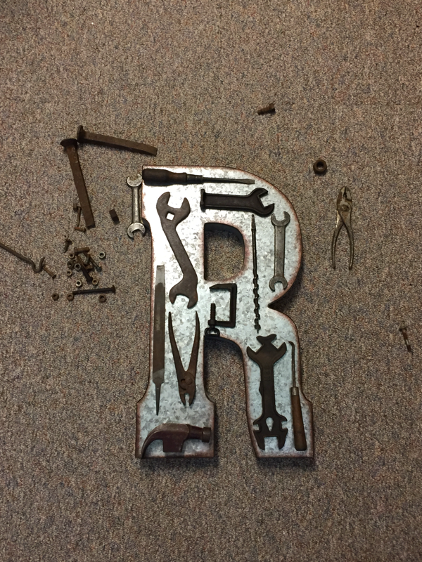
Although my plan B wasn't as creative or so called "artsy," I still love the outcome. For this I just bought a metal "R" at hobby lobby that would match the "rustic" theme. Then I spent a while arranging the tools on it until it was just how I wanted and finally I glued them on!
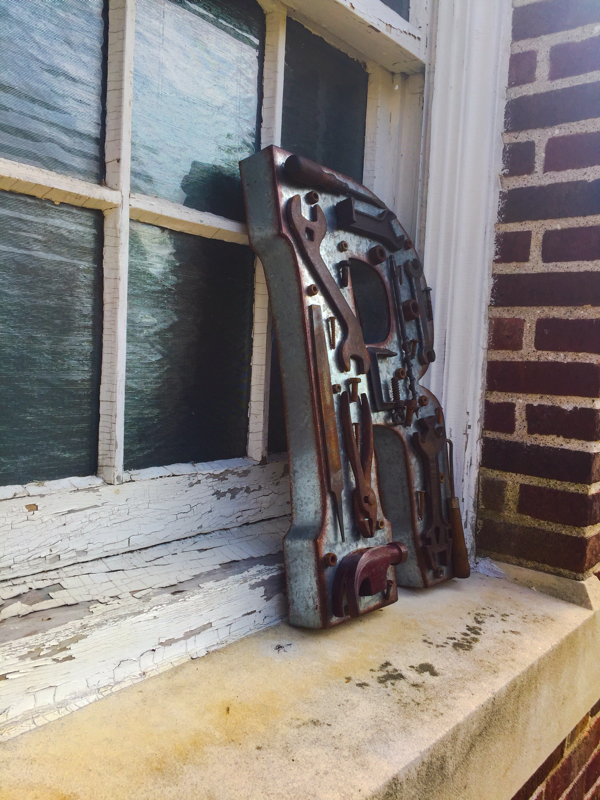
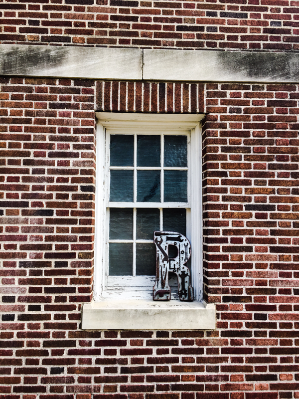
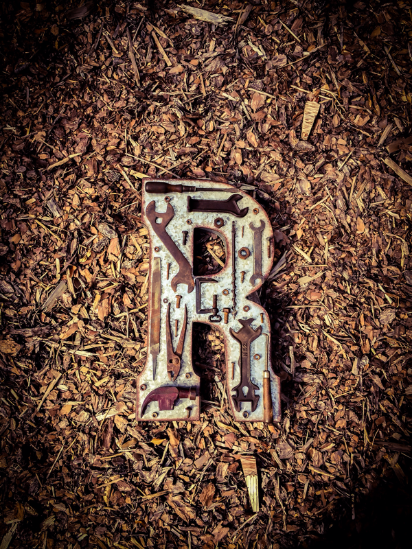
Finally I photographed my letter in places that I thought it would fit.

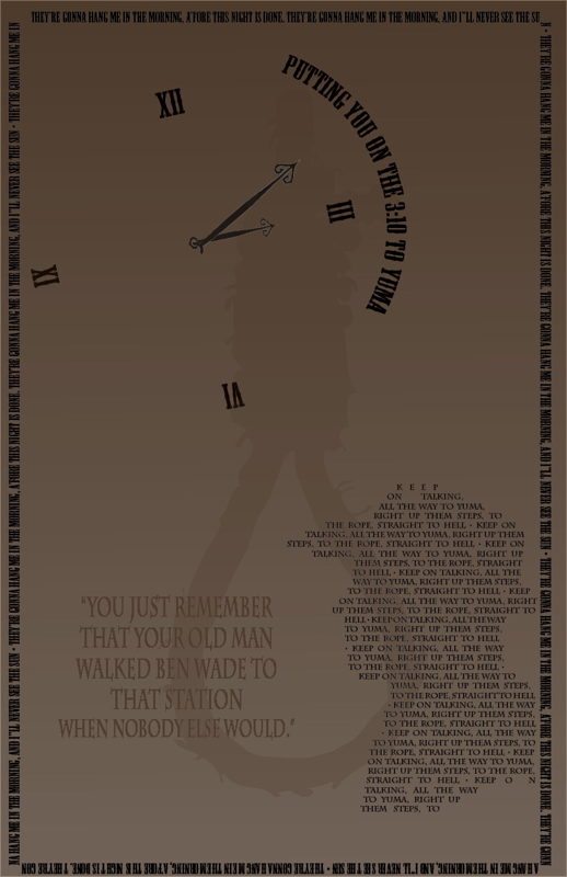
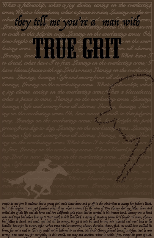
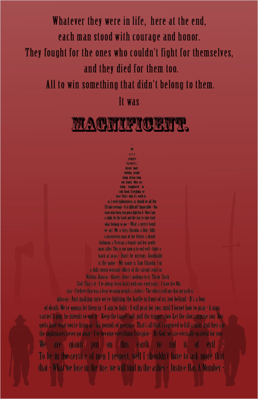
Project #2: Posters
For my three movie I did recent western remakes. I loved my quotes and main points of the posters, but I didn’t think that they flowed well together. Individually I loved them but together, not so much.
Week 4: Book Layouts
I used some of my own, here they are!
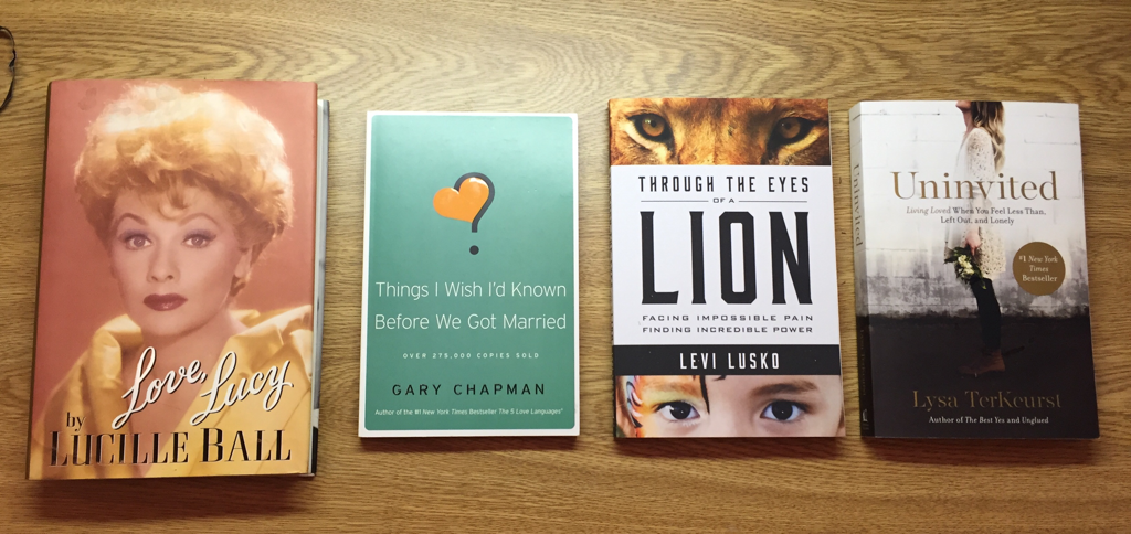
Love, Lucy
margin sides & top/bottom: 1” & 1 1/4
pages numbers: bottoms middle
Things I Wish We’d Known..
margin sides & top/bottom: 5/8” & 5/8”
page numbers: top right
Through the Eyes of a Lion
margin sides & top/bottom: 5/8” & 7/8”
page numbers: bottom middle
Uninvited
margin sides & top/bottom: 5/8” & 7/8”
page numbers: top middle
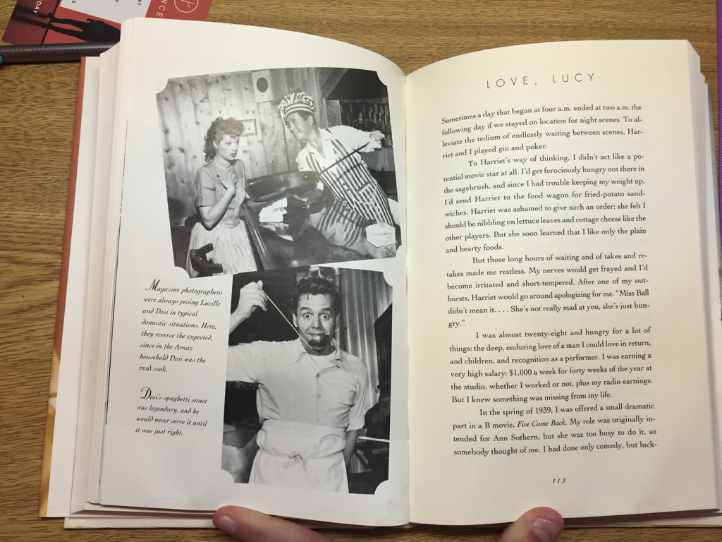
It was interesting to see the different fonts, font sizes, and margin sizes in just four books. I think it’s something that we don’t really notice that much unless we’re comparing a children’s book to a Harry Potter book. Below is my favorite layout because it involves pictures and text.
margin sides & top/bottom: 1” & 1 1/4
pages numbers: bottoms middle
Things I Wish We’d Known..
margin sides & top/bottom: 5/8” & 5/8”
page numbers: top right
Through the Eyes of a Lion
margin sides & top/bottom: 5/8” & 7/8”
page numbers: bottom middle
Uninvited
margin sides & top/bottom: 5/8” & 7/8”
page numbers: top middle
It was interesting to see the different fonts, font sizes, and margin sizes in just four books. I think it’s something that we don’t really notice that much unless we’re comparing a children’s book to a Harry Potter book. Below is my favorite layout because it involves pictures and text.
Project #3: Books
Whem decidimg what books I wanted to do, I knew I didn’t want to do chapter books because I could only choose 1 or 2 chapters and I’m a perfectionist so I would want the whole thing in there. So I decided to choose three short stories for a “Virtue Book” that I had when I was little. I chose the three that I remember reading the most.
1. The Honest Woodcutter
2. Jack and the Beanstalk
3. The Elves and the Shoemaker
I want the size of the book to be square about 8” X 8”. I like this size because it’s not as big as a picture big (since I won’t be using pictures) but it’s not as small as a chapter book. It’s more inviting for kids! For my font I decided to use Superclarendon. I like this one because it’s easy to read and basic (like Times New Roman) but some of the letters are a little offset so it makes it more fun! I’m excited to see how they turn out!
Week 5
Project #4: Spread
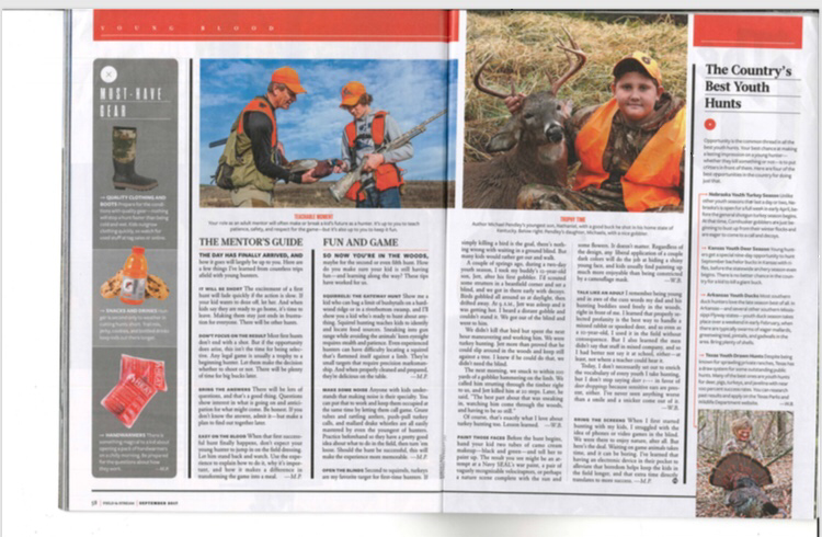
Here is my spread that I chose to duplicate. I’ve been a hunter since as long as I can remember so this one stood out to me and I thought it’d be fun! Just looking at it, I don’t like the layout that much. For me it looks kind of “blocky” and doesn’t flow well. Wouldn’t be my first choice of layout. But, I’m no expert so I’ll see how it goes! I have yet to find out the fonts, and I think this project will be a great learning experience!
Week 6-8
Project #5: Resumé
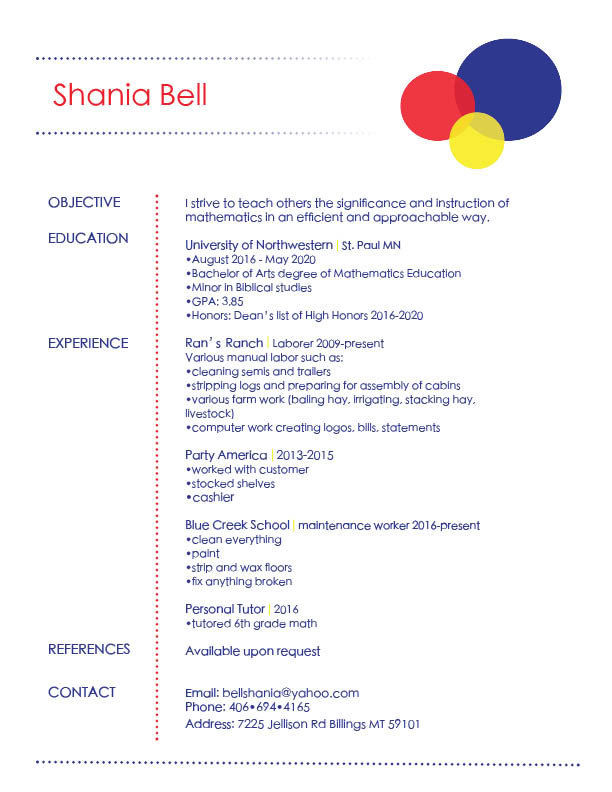
I chose to do a simple design because I'm teacher, not a designer. I really liked the outcome of this project. I think its simple but attractive. I thought that maybe the elementary colors were more for an elementary teacher, even though I'm secondary. But, hey, I still loved how it turned out!
Project #3: Books
My books were not on the Gutenberg website so I had to type them out. It wasn’t too horrible since they were short stories. I bought my supplies at Hobby Lobby to create the covers, so hopefully they will turn out!
